Zentras: A Bold Blackletter Typeface for Digital Impact
Two weeks ago, I was finalizing the hero section of a boutique online store launching handmade leather goods — minimalist photography, warm neutral tones, and a clear value proposition. The client wanted “timeless but not tired, strong but not aggressive.” I’d tested three serif fonts, two clean sans serifs, and even a subtle script — all felt either too quiet or too generic. Then I loaded Zentras.
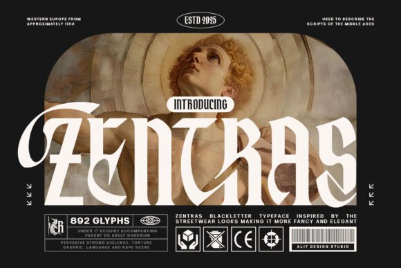
Right away, it clicked. Not as body text — never that — but as the single-line headline over a full-width image banner: “Forged by Hand. Worn with Purpose.” Zentras delivered instant presence. Its sharp, chiseled terminals and confident vertical stress evoke Roman inscriptions, yet the spacing, open counters, and restrained contrast keep it legible on screen. It’s not medieval revivalism — it’s blackletter reimagined for digital clarity.
Zentras lives in the display font category, meaning it thrives where attention matters most: hero titles, section headers, CTA buttons (when sized thoughtfully), logo lockups, and campaign banners. I used it for the main headline, the “Shop Now” button, and the footer tagline — each time at a size and weight that preserved its character without sacrificing scannability. On mobile, I dropped it to 28px with generous letter-spacing and paired it with a tight line-height. It held up beautifully — no crowding, no visual noise.
What makes Zentras work so well in real layouts isn’t just its aesthetic — it’s its intentionality. Unlike many blackletter fonts that prioritize ornamental density over function, Zentras balances drama with discipline. The uppercase ‘A’, ‘M’, and ‘T’ have strong, stable forms; lowercase glyphs are minimal but distinct. There’s no excessive flourish to distract from meaning — just confident, grounded letterforms. That’s why it feels sophisticated rather than costumey, especially next to clean supporting type.
For pairing, I went with Inter — a highly readable, variable sans serif — for all body copy, navigation, and product descriptions. The contrast is intentional: Zentras commands attention; Inter delivers information. No competing personalities, no visual fatigue. On a coaching website I’m currently refining, I used Zentras for the headline “Clarity Starts Here” and Inter for the subhead and bullet points outlining session structure. The hierarchy felt immediate — users didn’t need to think about where to look first.
Readability testing across devices confirmed what I suspected: Zentras shines on light backgrounds and semi-transparent overlays (like a 70% black overlay on a textured photo). Over dark mode interfaces, I switched to its lighter weight — not the thinnest, but a balanced medium — and increased tracking slightly. It remained authoritative without feeling harsh. On small CTAs (think 140×48px buttons), I reserved Zentras only for short, high-impact phrases — “Join Today”, “Launch”, “View Collection” — never longer than three words. Anything more strained the rhythm.
I also checked what came in the package before committing: six weights (from Thin to Black), true italics (not skewed), OpenType features including stylistic alternates and ligatures, full Latin-1 support, and robust webfont files (.woff2 optimized). No surprises during dev handoff — no missing glyphs mid-sentence, no fallback jank on slow connections. Licensing was clearly stated for commercial web use, including SaaS dashboards and client sites. That peace of mind matters when you’re shipping design systems, not just one-off pages.
In practice, Zentras works best when treated like a design accent — not wallpaper. I’ve seen it elevate a portfolio homepage where the designer’s name appears in Zentras above a grid of case studies. It anchors a course sales page header where “Master Visual Storytelling” sits above a clean video preview. It adds gravitas to a digital brand kit’s cover slide — not as filler, but as deliberate voice. It doesn’t try to be everything; it excels at being *the thing* that signals confidence, craft, and cohesion.
That said, it’s not universal. Avoid using Zentras for long paragraphs, form labels, pricing tables, or anything requiring rapid scanning. Don’t force it into tight navigation bars or tiny social media graphics. And if your brand voice leans playful, bubbly, or ultra-minimalist, Zentras may feel tonally misaligned — not because it’s “bad,” but because typography is relational. It gains power from contrast, context, and restraint.
One unexpected win? Email headers. In a recent newsletter redesign for a creative studio, we used Zentras for the subject-line preview text inside the email body (“Your Q3 Creative Review Is Ready”) — sized at 32px, centered, with 1.2 line-height. Opens and click-throughs held steady, and several clients commented on how “distinctive yet professional” the layout felt. That’s the sweet spot: distinctive enough to stand out in a crowded inbox, professional enough to earn trust instantly.
If you're choosing a premium font for a landing page, boutique shop, portfolio, or campaign site, ask yourself: does this typeface deepen the story — or just decorate it? Zentras deepens. It carries weight without heaviness, history without stiffness, boldness without shouting. It’s a blackletter typeface built not for nostalgia, but for now — for designers who want their digital typography to mean something, not just look something.
Before you drop it into your next Figma file or CSS declaration, test it where it counts: over real imagery, on real devices, beside real body text. See how it breathes. See how it guides the eye. See if it makes your message feel more certain — not louder, but surer. That’s when you’ll know Zentras isn’t just another font. It’s part of the voice.